User-Focused Visualization of Qualitative Data
The aim of the project was to find new and innovative ways of visualising data in a SaaS product. The iterative process spanned over a period of six months and included user research, ideation, prototyping, and evaluation. It resulted in two concepts and a set of guidelines for designers who work with data visualization for strategic planning platforms.
User Research: Understanding the context and the problems
Three personas were created based on the results from the user research.
The first part of the process was concerned with getting to know the users. This was done through an extensive user research phase consisting of interviews, observations, questionnaires, and analysis.
Based on the user research, key takeaways were that users sometimes struggle in getting an overview of the data in Stratsys.
Personas were built by using findings from the user research. Recurring themes from different work roles were extracted and compiled into three different personas.
Iterative Work
After the user research phase was finished, the iterative part of the project started. It consisted of three iterations, each including ideation, prototyping, and evaluation.
Iteration 1: Generating a multitude of ideas
In Iteration 1, the main focus was trying to compile all the results from the literature studies and user research to come up with as many possible visualization ideas as possible. Therefore, a great effort was put into ideation.
We started the ideation with the method How Might We, where we used user answers from a previous questionnaire as a basis. This was followed up with regular brainstorming, sketching, and Crazy 8’s.
The 15 most promising ideas were selected and lo-fi prototypes were made to conceptualize them. These prototypes were evaluated using heuristic evaluation and SWOT analysis. After the evaluation, 10 of the prototypes were selected for further development in Iteration 2.
The method Crazy 8’s was used as a means of coming up with as many ideas as possible.
The remaining concepts were ranked by users based on how well they support the users’ work and how much overview they provide.
Iteration 2: Investigating the most promising ideas
The second iteration started out with ideation on how to solve the problems found in the concepts during the evaluation in Iteration 1, using the method How Might We. This was followed by sketching solutions and making prototypes in Adobe XD.
A main focus of Iteration 2 was finding out how the users would react to the concepts. Therefore, we conducted several interviews with Stratsys users, where we showed and explained our concepts. We also constructed a questionnaire where users could see and react to the concepts.
Iteration 3: Hi-fi prototypes and user evaluation
In Iteration 3, the main focus was solving the issues found during Iteration 2 and creating prototypes with as high fidelity as possible. We also needed to get input from users to see if the concepts met the requirements of the project., which is why we conducted interviews as a final evaluative method.
Results
The results of the project were prototypes of two design concepts, and a set of design guidelines for designers working with strategic planning platforms.
Concept 1:
Expandable
Cards
Expandable Cards is a concept that focuses on showing a compact overview of the information, such as measurements. The information is structured in categories where the category represents the goal that the measurement belongs to. Each category is colour-coded to indicate that the nodes with the same colour belong to the same goal, which is especially valuable when nodes are marked as favourites and placed in the favourites section.
Concept 2:
Scorecards
Scorecards is a concept that focuses mainly on the data object called measurements. The hierarchy between nodes is not in focus but can be seen in the side panel that is included.
The side panel to the right is used to show the hierarchy of the data, as well as detailed information. The fields with detailed data in the detail panel can be expanded either by clicking a headline in the side panel or by selecting a card in the main visualization.
Data Visualization Guidelines
For Strategic Planning Platforms
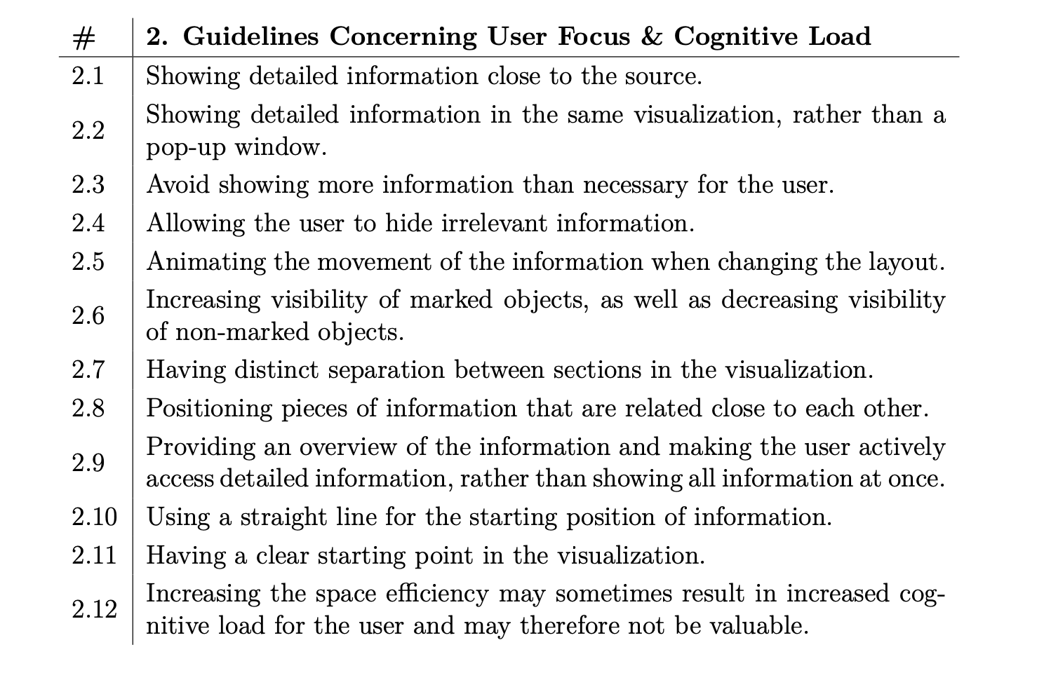
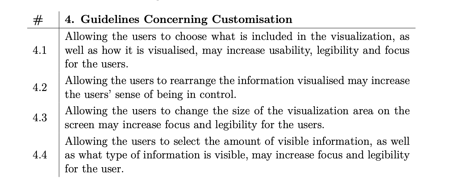
The guidelines are based on tendencies discovered during a limited amount of research and should be seen as indications rather than strict rules. The guidelines focus on: Colour Usage, User Focus and Cognitive Load, Legibility and comprehension, Usability, and Customisation. The guidelines also provide considerations to be aware of during design and evaluation, in the sections: Considerations Concerning Design and Considerations Concerning Evaluation.


